most ai photo tools have one aesthetic. it's usually a beige, slightly desaturated, “generic editorial” look — the average of every fashion shoot the model was trained on. you can't actually build a jewelry brand on it, because every brand on it looks like the others.
we built bling ai differently. there are fourteen distinct studios in the app — each a complete photographic world, with its own light, palette, brand lineage, and signature composition. some are warm and quiet. some are loud and chrome. one is a literal vault.
your brand is somewhere in there. this guide is the brand-by-brand map.
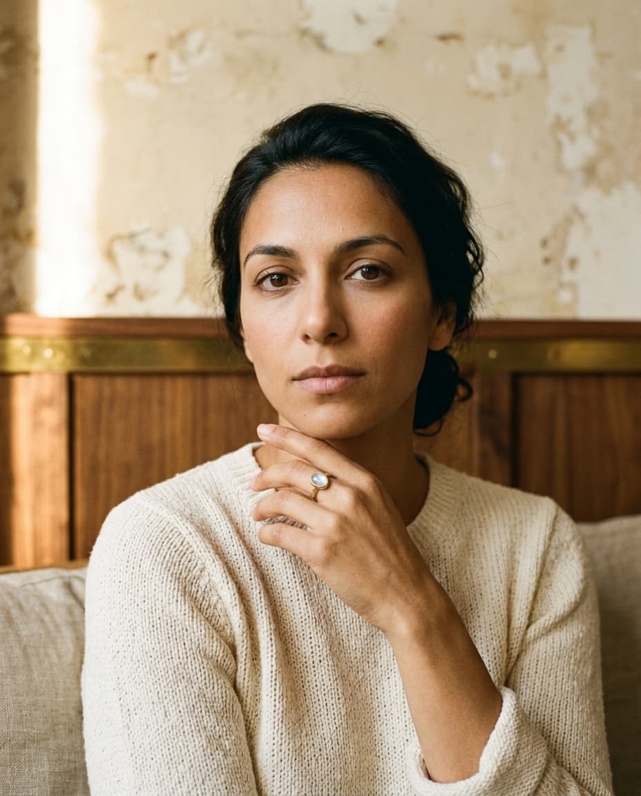
patina
warm earthy. quiet luxury.
soft natural light, golden hour, walnut and cream textures, oxblood silk. patina is the founder of bling ai's warm aesthetic — the one most independent jewelers gravitate to instinctively because it makes pieces feel intentional, not loud.
in the spirit of: aurate, mejuri, catbird.
best for: indie and handmade fine and demi-fine — pieces that want to feel inherited, considered, used. the workhorse studio for etsy sellers building a recognizable feed.
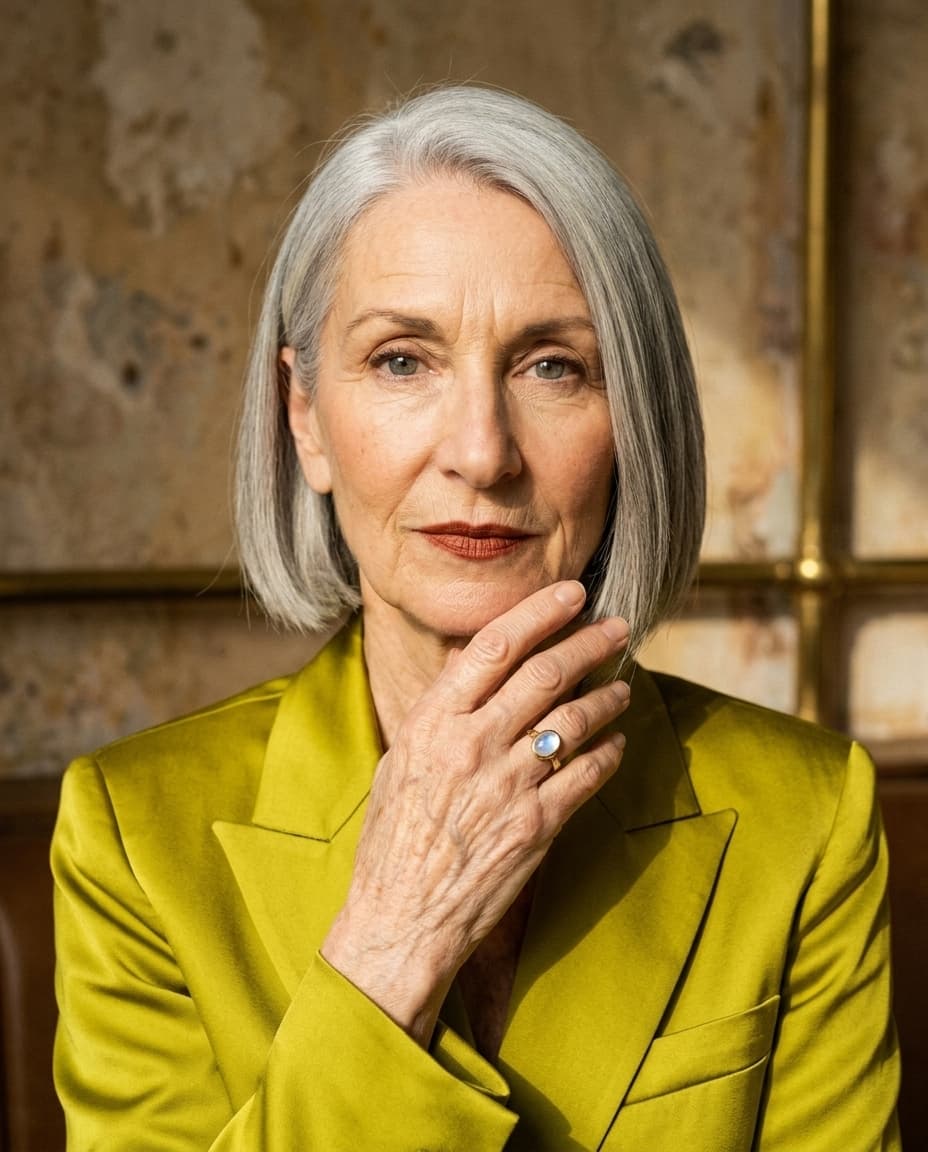
strobe
editorial bold. color-forward.
chartreuse silk, cobalt cashmere, brass-and-terrazzo interiors, mid-laugh composition. strobe is for designer pieces with personality and opinion — the antidote to the muted-beige default.
in the spirit of: vogue, the row, bode.
best for: statement pieces, designer collaborations, anything where the jewelry needs a backdrop loud enough to match it. pairs especially well with our model iris — an eighty-year-old in chartreuse who refuses to disappear.
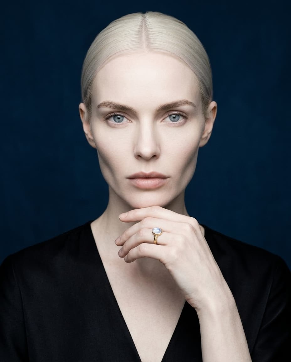
glacier
cold luxury. vault-coded.
controlled studio light, midnight navy backdrop, cartier-grade composition, bulgari restraint. glacier shoots the serious end of the catalog the way a heritage maison would — like a print ad, not a product shot.
in the spirit of: cartier, bulgari, boucheron.
best for: fine jewelry where the cold-luxury cue does the selling — diamonds, platinum, signature collections, anything you want to feel like a brand campaign rather than a listing.
vellum
clean catalog. seller-grade.
warm-white seamless paper, controlled overhead light, isolated product. vellum is the disciplined one — it shoots the piece, not the story. when an etsy listing needs the same hero shot the hermès e-com team would commission, vellum is the call.
in the spirit of: hermès, tiffany & co, aesop.
best for: product pages, marketplace listings, paid ads. less mood, more inventory hero. the studio you reach for when you need the piece to be the loudest thing in frame.
halo
chrome shine. club-coded.
liquid-chrome wall, neon spill, hard on-camera flash, hyperreal digital sheen. halo is the loud studio — y2k revival, statement chains, body jewelry, anything that wants to be seen across a club.
in the spirit of: blumarine, heaven by marc jacobs, diesel.
best for: statement chains, body jewelry, y2k-revival lines, brands targeting a gen-z buyer who came up on the chrome 2000s. not a quiet studio. that's the point.
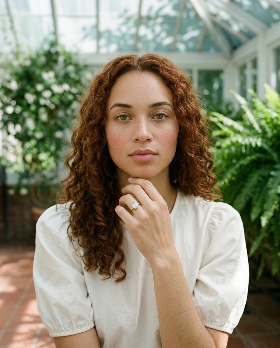
verdure
garden romance. botanical.
victorian conservatory, climbing jasmine, dappled light through glass, terracotta floor. verdure is the slow-morning studio — for pastoral fine jewelry, cotton-puff sleeves, anything floral.
in the spirit of: doen, sezane, la doublej.
best for: romantic fine jewelry, bridal alternatives, anything where the styling wants to feel like a sunday garden brunch instead of a campaign. pairs naturally with our model lila — auburn ringlets, freckles, soft green light on her.
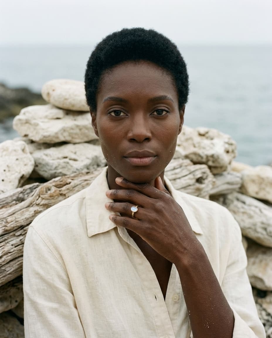
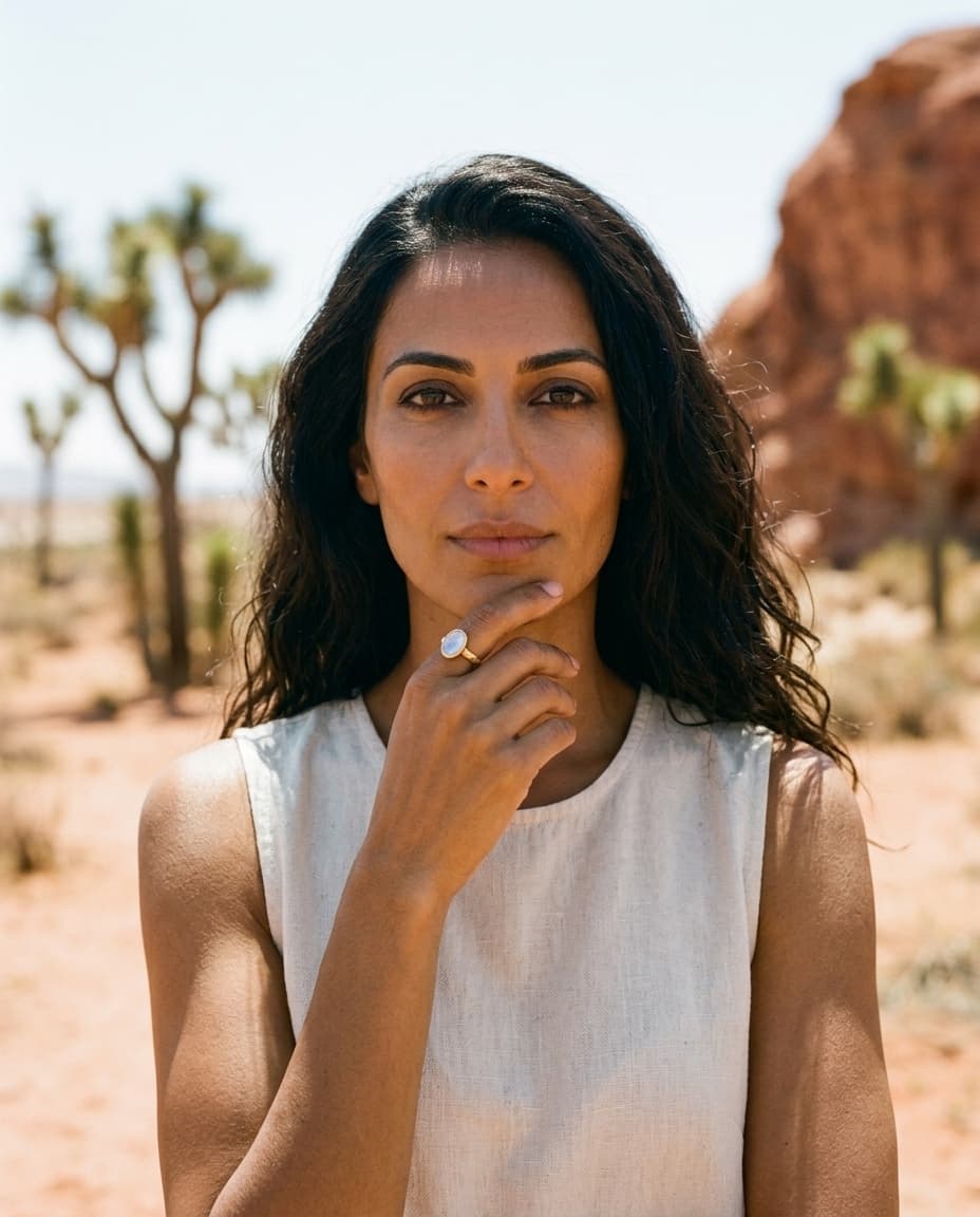
tide
coastal. salt-air.
bleached limestone, sea haze, sun-faded linen, mineral cool-grey palette. tide is the slow-summer studio — mediterranean and cycladic-coded, the kind of jewelry that looks most natural on a body that's been outside.
in the spirit of: loewe paula's ibiza, toteme, faye toogood.
best for: organic shapes, moonstone and pearl, demi-fine that wants to read as artisan rather than aspirational. the cover of this guide is a tide shot — naomi at the coast, moonstone ring at her chin.
cast
sculptural. brutalist.
raw concrete plinth, hard architectural shadow, monochrome cool grey, single directional strobe. cast shoots the piece as an object on a plinth — the studio you call when the jewelry is a sculpture.
in the spirit of: bottega veneta, maison margiela, phoebe philo.
best for: sculptural designer pieces, oversized rings, conceptual collections, anything where the silhouette is doing the work. menswear-coded too — works beautifully with theo and arjun.
veil
bridal pearl. blush romance.
tulle and silk drapery, soft northern-window light with a backlight halo, ivory and blush palette. veil is the bridal studio — tender, considered, the morning of a small wedding.
in the spirit of: mira zwillinger, hayley paige, tiffany engagement.
best for: engagement, bridal, and pearl pieces. anything where the audience is shopping for a moment, not a thing.
atrium
heritage. archival grandeur.
green-veined marble columns, oil-painting walls, gilt frames, late-afternoon raking sun. atrium is the heirloom studio — the dowager-countess's library, with the jewelry on her hand.
in the spirit of: buccellati, verdura, van cleef & arpels archive.
best for: estate, antique, and archive-coded pieces. heritage gold-work, signed antiques, anything that wants to look like it's been in a family for three generations.
solstice
desert. sun-hot.
rust-red sand, joshua trees, hot overhead sun, terracotta and bleached oat palette. solstice shoots joshua tree at four in the afternoon — for southwest, boho-fine, and earth-toned pieces.
in the spirit of: pamela love, jennifer fisher, saint laurent marrakech.
best for: turquoise, hammered gold, boho-fine, southwest-coded jewelry. anything that looks most at home on warm skin in warm light.
reel
70s film. nostalgic editorial.
period-correct 1970s interior, warm window light, mustard silk, kodak gold grain. reel shoots a 1978 cover — for retro-styled pieces, halston-era vogue italia adjacent.
in the spirit of: halston, vogue italia 1978, saint laurent rive gauche.
best for: retro-revival, archive-coded, anything that wants the warm grain of analog film. underused — when you find the right piece for it, the result is unmatched.
suite
penthouse luxe. warm power.
mahogany panels, leather chairs, single brass-lamp warm key light, evening interior. suite is the menswear studio — for watches, cufflinks, signet rings, executive-coded fine jewelry.
in the spirit of: tom ford, vintage rolex print, loro piana.
best for: men's jewelry, watches, heritage timepieces, anything that wants to read as serious. our model jin-soo defaults here.
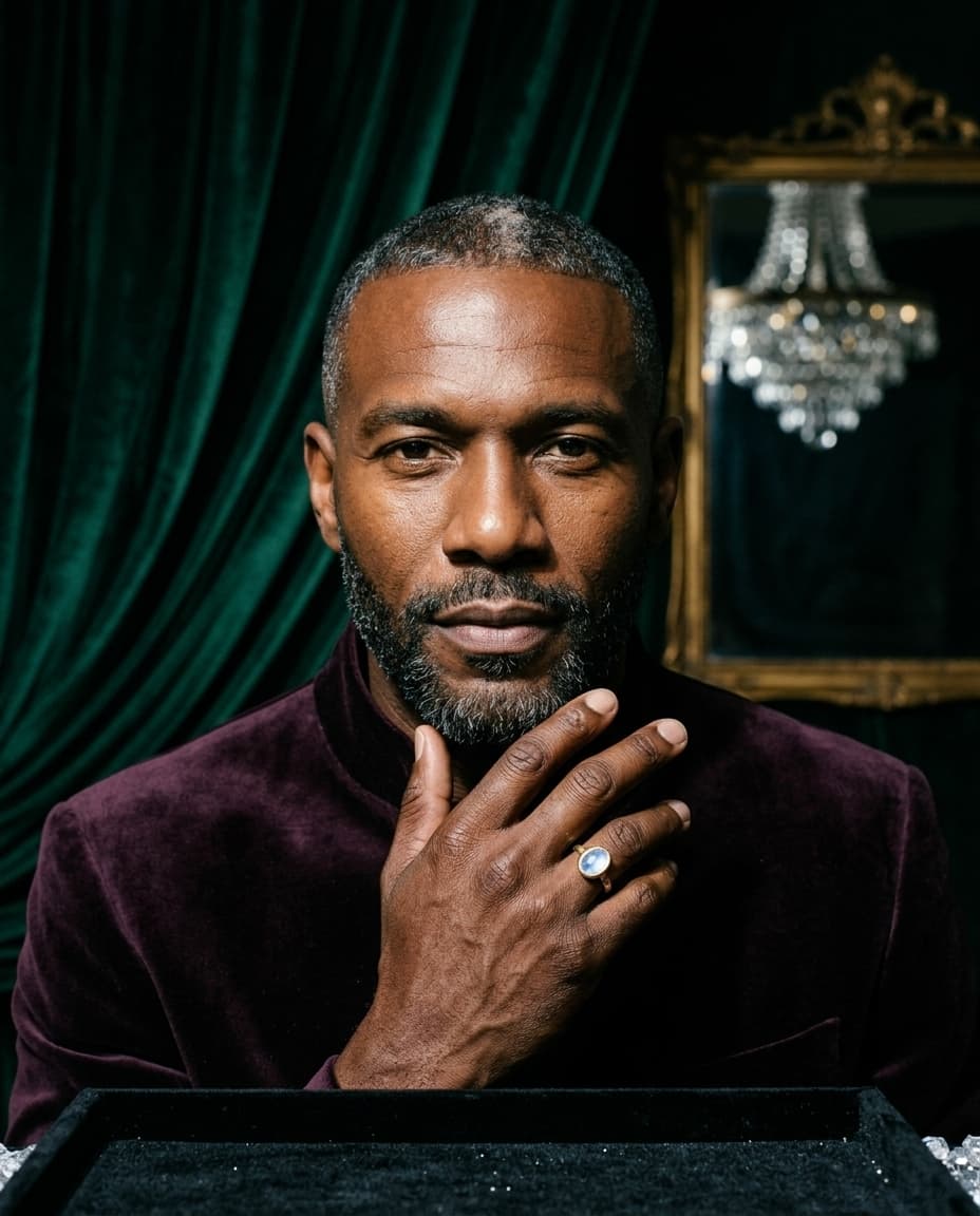
vault
iced. velvet stage.
deep emerald or wine velvet drapery, single hard spotlight with tight specular sparkle. vault is the auction studio — for diamond-heavy, statement, and collection-viewing-coded pieces.
in the spirit of: cartier ice, pharrell joopiter, christie's magnificent jewels.
best for: diamonds, statement pieces, auction lots, brand campaigns where the jewel is the entire frame. the loudest of the cold-luxury studios.
picking yours
most jewelers find their studio in the first three. patina handles the warm-earthy default. glacier handles the cold-luxury serious end. strobe handles the loud editorial end. between those three, you cover ~70% of indie jewelry brands.
the other eleven are for the specific cases — solstice if you sell turquoise, veil if you sell engagement, suite if you sell men's, halo if you sell chains, atrium if you sell estate. they aren't alternatives to the first three so much as expansions of what bling ai can shoot when your inventory doesn't fit a generic mood.
your brand has a mood. one of these fourteen matches it. start with the studios index →